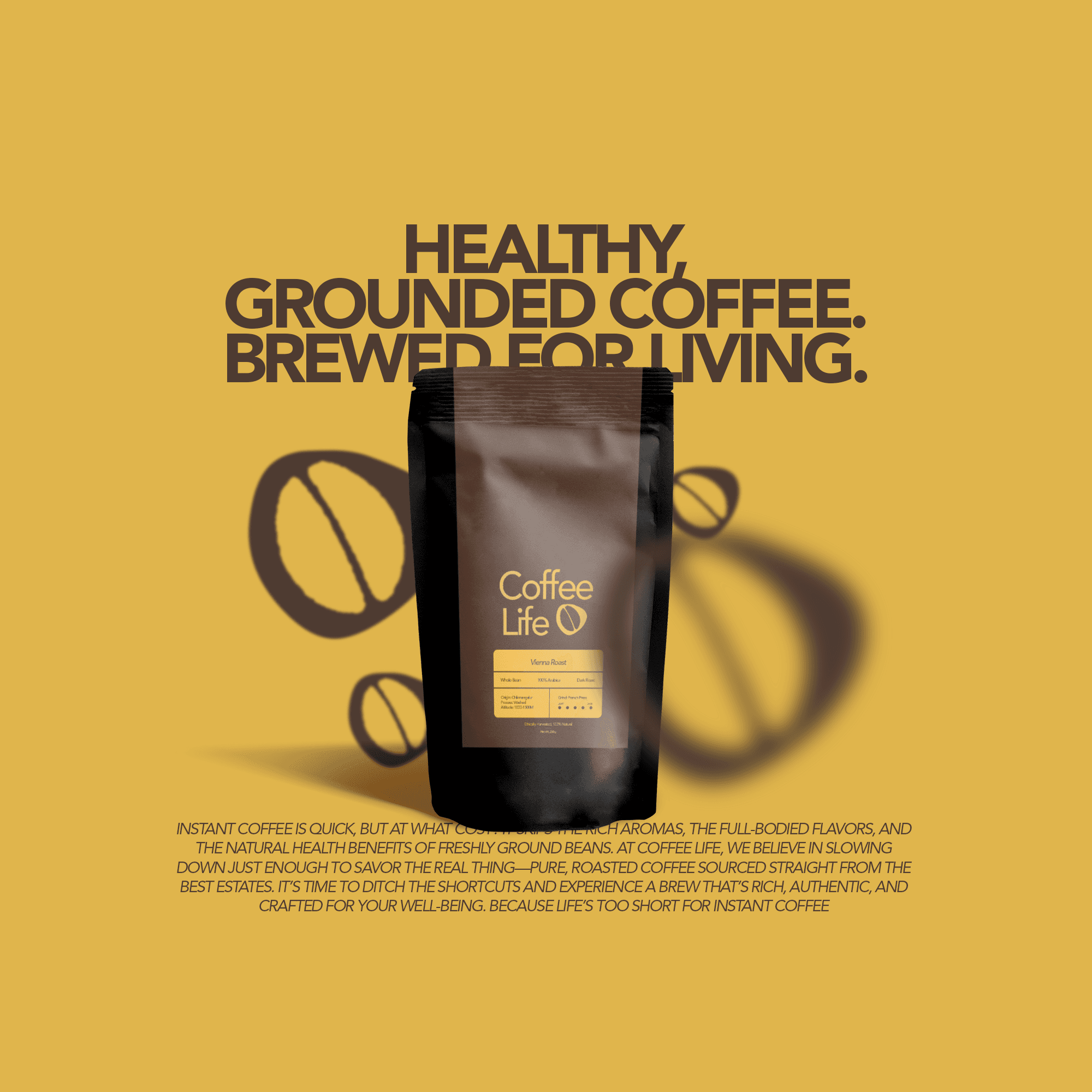
Objective
To build a brand system that feels royal, memorable, and culturally grounded — while translating well across packaging, signage, and digital.
Design Direction
The logomark blends an ornate ‘kf’ ligature with sweeping strokes inspired by traditional Arabic calligraphy, hinting at syrup drizzles and dessert flourish. The wordmark is a clean, geometric contrast — balancing heritage with modernity.
The primary color palette uses a rich burnt orange and a pale pistachio green. The warm hues evoke spice, clay ovens, and saffron — a nod to the richness of Middle Eastern culinary traditions, while also standing out on shelves and in feeds.

Applications
Logo System – Typographic mark + minimal emblem
Packaging – Modular boxes with oversized KF motifs
Carry Bags – Bold, pattern-led visuals for high recall
Color & Typography – A distinctive, editorial feel through serif-grotesque contrast