Objectives
Use real Urban Dictionary entries as narrative material
Let typography and layout carry the emotion
Build a drop that feels intellectual, cheeky, and clean
Create something that feels equally museum-store and street-corner
The Designs
1. SCANTY
A red + white tee exploring the term “scanty” — often used to describe anything shady, nasty, scandalous, or generally unpleasant.
Front: Raw handwritten type
Back: Block text layout surrounding a harsh, confrontational illustration — designed to feel uncomfortable in a beautiful way
Tagline: “From unkempt to unpleasant. Scanty is the term.”
2. SIDEQUEST
A tee for the detour-takers. Inspired by the chaos of diverging from the main path.
Front: Minimal logotype and scattered brushstrokes
Back: Massive wraparound strokes + a tucked-away definition:
“When you and your bestie detach from group for your own side club adventure.”Style: Streetwear meets sketchbook

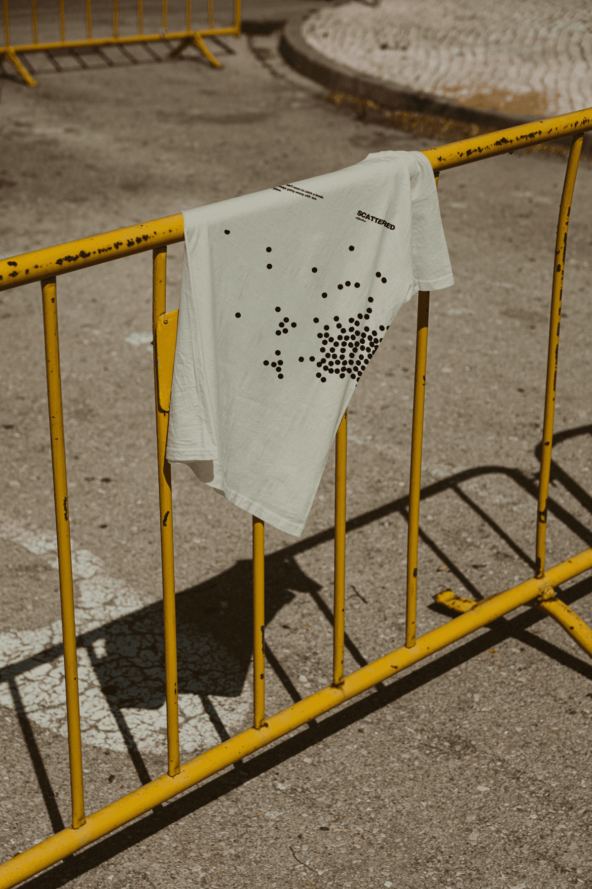
3. SCATTERED
A visual metaphor for the feeling of being all over the place.
Front: Dense dot clusters fading into scattered space
Back: Loosely mirrored layout
Definition reads:
“Someone that just can’t seem to catch a break. Something is always going wrong with 'em. All over the place.”
Challenges
Balancing high-concept copy with clean visual form
Making each design unique while keeping them in the same visual language
Ensuring screen print clarity despite layout complexity
“I gave him a half-baked idea and he turned it into a proper collection. We loved the designs. ”
— Pushkar Prasad, Founder, pHProjecct